This week my team took notice of great design in our everyday lives - and let's be real, sometimes our everyday lives include escaping to the movies. My recommendation: watch them all and be inspired. Nancy Meyers has a reputation for creating and using enviable interiors in all of her films. I will confess I’ve seen all of Nancy Meyers films dozens of times each – and yes in part they are feel-good movies, but for me and my one track mind, I pour over the interiors. What I love most about her signature style is how timeless it is. While we watched her films ranging from 1995 to 2015, you can’t help but notice that A) she’s only gotten better and better but more importantly B) I’d still move right into any one of these places. Classic is ... well, classic.
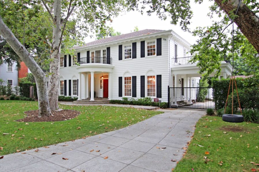
5. Father of the Bride – Steve Martin puts it best when he declares “it’s the leave it to beaver house everybody wants.” There is something about a white exterior in a charming neighborhood: picket fence – flower boxes ... you know what I mean, nobody can resist! In fact, this house reminds me of our feature Everyday USA home – right here in our own special and charming East Grand Rapids home base.
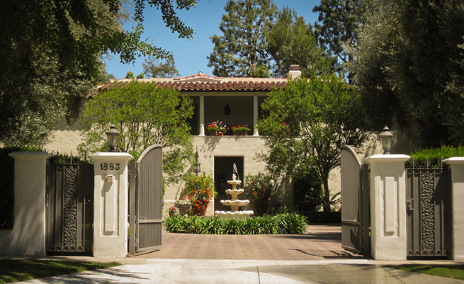
4. The Parent Trap – can you even choose between the Napa house or the London property? Seriously if you haven’t seen this movie in a while because well – you feel like it’s a little sappy. Watch it. It is sappy and good. AND you literally cannot choose where you’d prefer to stay – you know if somebody said you could have one or the other. Both classic in their respective geographies.
Left: Napa Above: London
Both classic in their respective geographies.
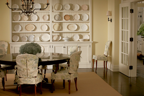
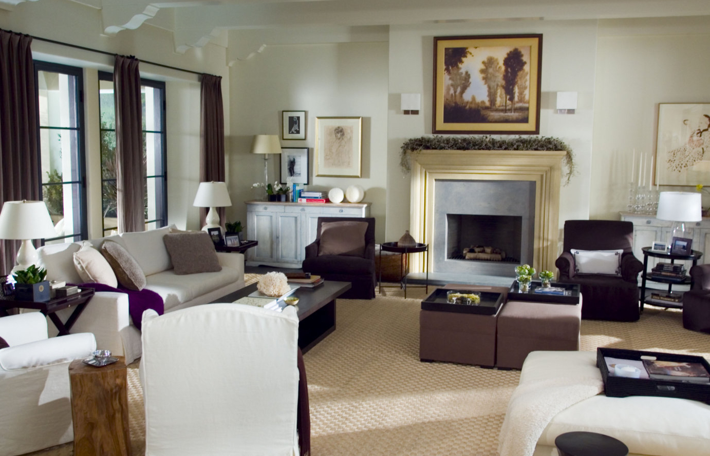
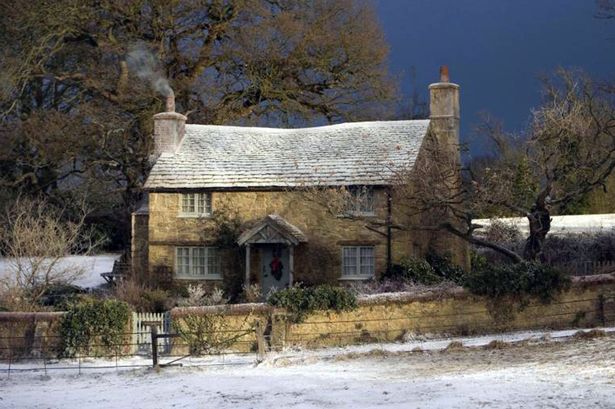
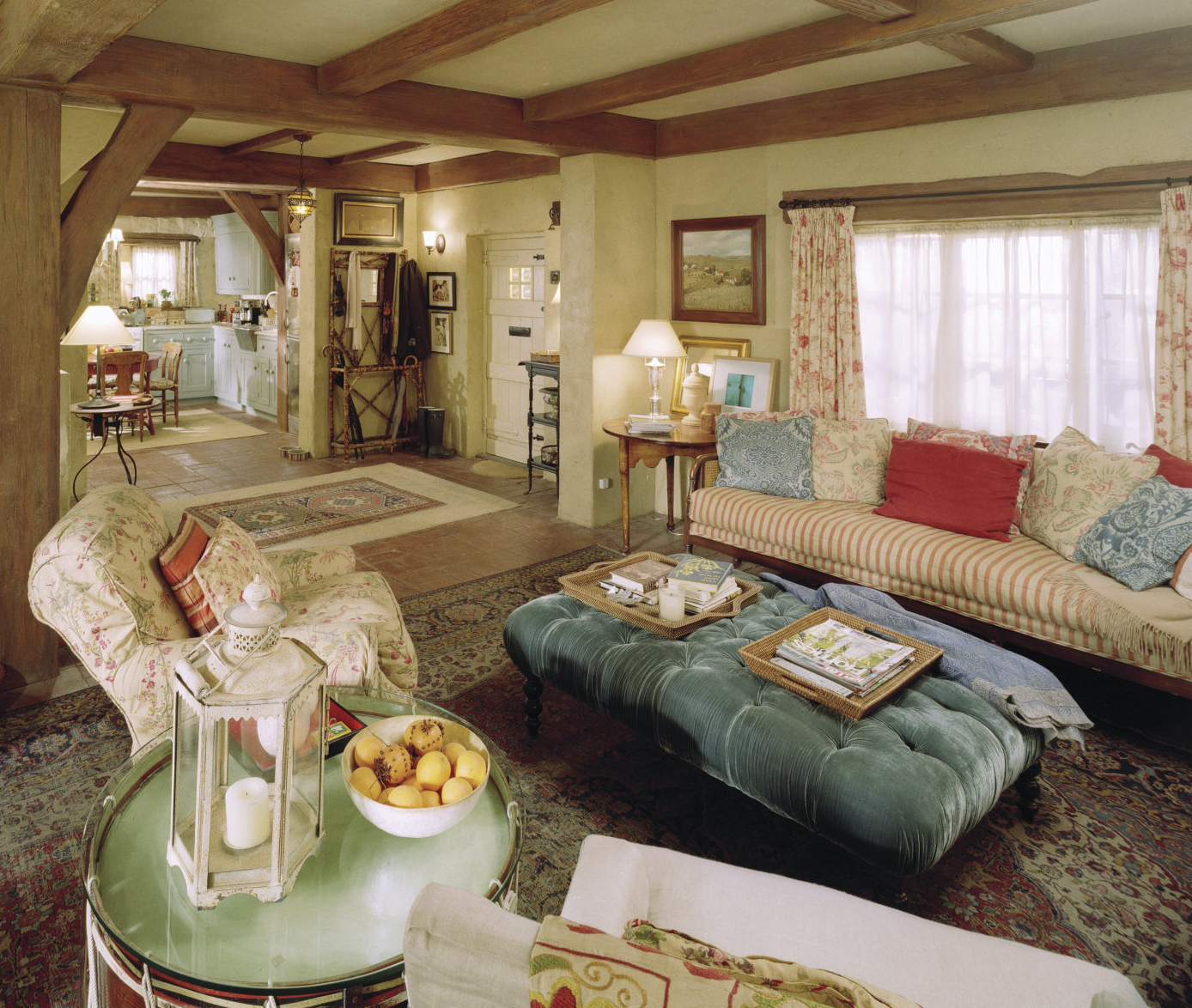
3. The Holiday – Again two swoon-worthy locations – you almost forget how cute Jude Law is in this movie – the architecture is that good. Every detail of the charming English cottage is perfection. And the California dream house - come on! Open clean and simple – layers of neutrals and full of easy textures. Watch it. Again.
Above: California Right: Rose Hill Cottage
2. It’s Complicated — Black steel windows are the star of this show – well that and Alec Baldwin’s antics. There is something so inviting about the perfect imperfection of this house – and the landscape. Tune in just for the gardens ... it will really make you want to grow lettuce.
There is something so inviting about the perfect imperfection of this house – and the landscape.
1. Something’s Gotta Give – right everybody knows this one. Honestly though it's over 15 years old and it still looks fabulous. Watch it again and pay more attention to Jack’s place – it's equally appealing and relevant with its masculine edge and moody colors.
These movies are fun to watch of course but her designs serve as the perfect crash course in timelessness. Make some popcorn and go to Nancy Meyers school of design. And then when you start daydreaming about your own project – think about this: what will my house look and feel like in 20 years? Enjoy!

